API rate limit visibility
A new dashboard to measure API usage
ROLE
PRODUCT DESIGNER
AT FRONT.COM
TEAM
DEVELOPER PLATFORM
As the sole Product Designer on Front’s Developer Platform squad, I led the design of API rate-limit visibility, a core infrastructure feature used by technical customers.
Front is a customer communication platform that brings channels into one shared workspace for support teams. Its API powers automations and system integrations behind the scenes, making reliability critical for companies that depend on these workflows.
My role and key responsibilities
→ Led end-to-end design of API rate-limit visibility for enterprise technical users
→ Defined dashboard architecture and data modeling approach
→ Introduced a new stacked bar visualization pattern to the design system
→ Drove cross-functional alignment across product and engineering
→ Ensured scalability and clarity within a complex, infrastructure-heavy surface
Considering this is a technical, API-focused feature used primarily by developers, engagement levels indicate strong relevance among power users managing integrations.
CONTEXT
Front enables companies to connect their internal systems through API calls, powering automations, workflows, and data synchronization across tools.
To ensure system stability, the API enforces rate limits, restricting how many requests can be made per minute.
As customers scale their operations, API usage increases significantly, especially during peak traffic moments.
PROBLEM
Customers were hitting API rate limits without any visibility into:
→ When limits were being reached
→ Why workflows were failing
→ Which integrations were responsible
This lack of transparency created frustration among technical teams and support escalations.
The core issue the absence of visibility and proactive feedback. For enterprise customers relying on API-driven workflows, this became a reliability and trust problem.
a new dashboard for customers to monitor their API usage
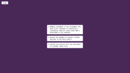
To address the visibility gap and restore trust in the platform, we defined strategic goals. The main one was to enable self-diagnosis, giving customers access to historical usage data. The second one was to surface usage patterns for customers to anticipate limits and make informed upgrade decisions.
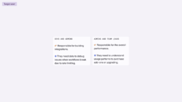
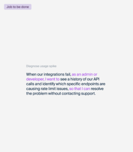
Defining the Core User Jobs
Defining these jobs to be done helped shape a dashboard focused on decision-making.
The design prioritized time-based analysis, endpoint and token-level filtering, and clear plan-limit visibility so teams could quickly diagnose spikes, understand frequency and severity of overages, and determine whether optimization or plan expansion was the right action.
Defining the Right Surface Within the Product
At a product level, I clarified where this feature belonged and how it should function within the broader system. Rate-limit visibility supports troubleshooting and system configuration, not performance analytics, so placing it in Developer Settings aligned with how technical users think and work.
Mapping the current and future states also revealed that rate limits were creating a reactive support loop, where failures led to tickets instead of in-product resolution.
The redesigned flow introduced historical usage insights, and clear upgrade pathways directly within the debugging context, turning an opaque infrastructure limit into a self-serve operational tool.
ITERATIONS AND FINAL DESIGN
I explored several graph types and benchmarked how other B2B tools visualize usage data before deciding on the final direction.
Line charts were useful for spotting spikes, but they didn’t clearly show the proportion between successful and rate-limited requests. I also tested more detailed breakdowns, but some added complexity without improving clarity.
The final design was a stacked bar chart because it made volume and distribution easy to compare at a glance. I then formalized it as a reusable component in the design system to support similar use cases across the product.
Exploring different visualization approaches to balance spike detection, rate-limit clarity, and upgrade context.
The interface surfaces total volume alongside a clear distribution between successful, failed, and rate-limited calls, making anomalies instantly visible.
IMPACT
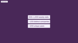
Within weeks of launch, the dashboard was generating 500–1,000 weekly visits across ~150 companies and ~200 technical users. For a developer-focused infrastructure feature, this level of engagement indicates strong adoption among the teams most impacted by rate limits.
API rate limit visibility
A new dashboard to measure API usage
ROLE
PRODUCT DESIGNER
AT FRONT.COM
TEAM
DEVELOPER PLATFORM
As the sole Product Designer on Front’s Developer Platform squad, I led the design of API rate-limit visibility, a core infrastructure feature used by technical customers.
Front is a customer communication platform that brings channels into one shared workspace for support teams. Its API powers automations and system integrations behind the scenes, making reliability critical for companies that depend on these workflows.
My role and key responsibilities
→ Led end-to-end design of API rate-limit visibility for enterprise technical users
→ Defined dashboard architecture and data modeling approach
→ Introduced a new stacked bar visualization pattern to the design system
→ Drove cross-functional alignment across product and engineering
→ Ensured scalability and clarity within a complex, infrastructure-heavy surface
Considering this is a technical, API-focused feature used primarily by developers, engagement levels indicate strong relevance among power users managing integrations.
CONTEXT
Front enables companies to connect their internal systems through API calls, powering automations, workflows, and data synchronization across tools.
To ensure system stability, the API enforces rate limits, restricting how many requests can be made per minute.
As customers scale their operations, API usage increases significantly, especially during peak traffic moments.
PROBLEM
Customers were hitting API rate limits without any visibility into:
→ When limits were being reached
→ Why workflows were failing
→ Which integrations were responsible
This lack of transparency created frustration among technical teams and support escalations.
The core issue the absence of visibility and proactive feedback. For enterprise customers relying on API-driven workflows, this became a reliability and trust problem.
a new dashboard for customers to monitor their API usage
To address the visibility gap and restore trust in the platform, we defined strategic goals. The main one was to enable self-diagnosis, giving customers access to historical usage data. The second one was to surface usage patterns for customers to anticipate limits and make informed upgrade decisions.
Defining the Core User Jobs
Defining these jobs to be done helped shape a dashboard focused on decision-making.
The design prioritized time-based analysis, endpoint and token-level filtering, and clear plan-limit visibility so teams could quickly diagnose spikes, understand frequency and severity of overages, and determine whether optimization or plan expansion was the right action.
Defining the Right Surface Within the Product
At a product level, I clarified where this feature belonged and how it should function within the broader system. Rate-limit visibility supports troubleshooting and system configuration, not performance analytics, so placing it in Developer Settings aligned with how technical users think and work.
Mapping the current and future states also revealed that rate limits were creating a reactive support loop, where failures led to tickets instead of in-product resolution.
The redesigned flow introduced historical usage insights, and clear upgrade pathways directly within the debugging context, turning an opaque infrastructure limit into a self-serve operational tool.
ITERATIONS AND FINAL DESIGN
I explored several graph types and benchmarked how other B2B tools visualize usage data before deciding on the final direction.
Line charts were useful for spotting spikes, but they didn’t clearly show the proportion between successful and rate-limited requests. I also tested more detailed breakdowns, but some added complexity without improving clarity.
The final design was a stacked bar chart because it made volume and distribution easy to compare at a glance. I then formalized it as a reusable component in the design system to support similar use cases across the product.
Exploring different visualization approaches to balance spike detection, rate-limit clarity, and upgrade context.
The interface surfaces total volume alongside a clear distribution between successful, failed, and rate-limited calls, making anomalies instantly visible.
IMPACT
Within weeks of launch, the dashboard was generating 500–1,000 weekly visits across ~150 companies and ~200 technical users. For a developer-focused infrastructure feature, this level of engagement indicates strong adoption among the teams most impacted by rate limits.
