Joinnext
Web App for Steinbeis University.

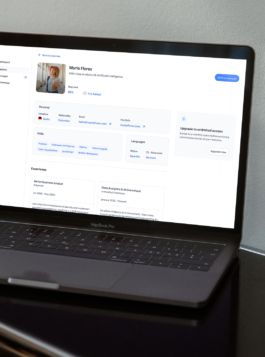
A view of the company's dashboard with an overview of all matches.
UX/UI design case study
MPV FOR web-based SaaS platform
Client
Schools of Next Practices
Steinbeis University
Companies hiring from Steinbeis University lacked a direct way to connect with students so this app was designed to bridge this gap, helping companies find pre-matched talent and giving students a structured way to present themselves professionally.
I led the design for this job-matching app. Started with user research to identify key pain points. Mapped user flows, and built interactive prototypes to define the MVP.
THE BUSINESS OPPORTUNITY
This case study shows how the app was designed to be integrated into the school community, giving companies access to a targeted group of students. The app would start with this specific group, with plans to scale to the entire university ecosystem. To generate revenue, the app offers companies two payment options: a monthly plan or to pay-per-match.
I proposed a lean research approach
With tight timelines and a clear MVP goal, I proposed a lean research approach. We ran a quick user survey to spot the most urgent pain points for students and hiring managers. From there, we iterated fast, validating ideas through usability tests with interactive prototypes. This helped us prioritize features and refine core flows before launch.
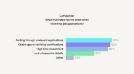
Students reported feeling unsure about how to present their profiles effectively (Fig. 1), while hiring managers pointed out a lack of clarity when reviewing candidates' backgrounds (Fig. 2). These findings guided us in refining both the student onboarding flow and the matches overview for companies.
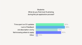
(Fig. 1)
(Fig. 2)
"If we could trust that every applicant presented to us is already pre-matched to our needs, it would save us hours. Sorting through piles of irrelevant applications, makes the process very slow." — Quote from a hiring manager
THE IDEATION PROCESS
Based on user insights I collected, I created initial flows for students and companies. This image was the initial draft, showing how the app could guide students through their journey (Fig. 3).
This served as a basic framework to map out the overall process:
From opening the app and completing initial setup to navigating the dashboard, including access to matches, preferences, profile, and payment options.

(Fig. 3) Student Journey: From initial setup to all features.
From here, I decided what actions were crucial and made low-fidelity wireframes to refine the flow. For students, the main focus was to create a clear onboarding process that allowed many profiles to be ready for matching.
I started with a single-screen onboarding, thinking a quick setup would encourage sign-ups. But in live tests, students found it overwhelming and skipped key fields. To fix this, I broke onboarding into steps (Fig. 4), reducing friction and guiding them through profile completion more naturally.
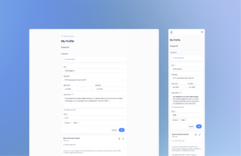
(Fig. 4) Step: Adding Experience. (Guiding users through profile completion)
Design Development
The user journey for students starts with a 10-minute onboarding flow designed to be clear and efficient. Students creating their profiles manually only need to provide basic information, education, and experience.
This streamlined process encourages more students to complete their profiles quickly, ensuring the platform has a robust pool of profiles to match from. While the initial setup is quick, students are incentivized to enhance their profiles over time for better matching opportunities (Fig. 5).

(Fig. 5) Onboarding flow for students, creating their profile and CV manually.
For hiring managers, it was crucial to provide a clear overview of the matches. At first, there is a limited view of any matched profile. After selecting a payment option, the company gets a complete view including contact data and can start communication. It was important to find a strategic place within the platform to remind hiring managers of the option to upgrade when needed (Fig. 6). This UX/UI design case study highlights how these features were integrated to enhance functionality and user flow.
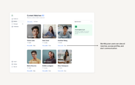
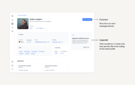
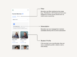
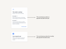
(Fig. 6) Screen for companies. Users can start communication with their matches after subscribing.
How Student Data Affects the company Interface
Through their profiles, students present their location, skills, education and work experience (Fig. 7). For hiring managers, I designed an initial view to quickly compare students’ skills and filter by location. From their dashboard, students can connect their profile with Insider, an e-learning platform from the same university. This integration provides hiring managers with access to completed courses and certifications (Fig. 8).
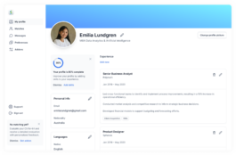
(Fig. 7) After completing the onboarding process, students are directed to their profile view.
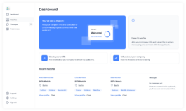
(Fig. 8) Hiring managers start on this dashboard, with a list of matches they can click to view full profiles.
Design system and accessibility
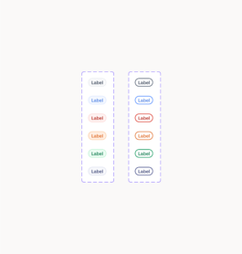
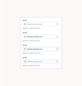
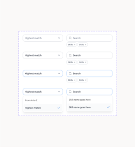
I used design variables throughout the system to ensure consistency and flexibility. To improve accessibility, I integrated a color contrast checker, ensuring that all text and foreground elements meet accessibility standards for readability.

MOVING FORWARD
In live moderated tests, users reacted positively to the guided profile setup but found some labels unclear. Hiring managers liked the match-based approach but wanted a way to refine search criteria further. These insights helped refine the UI and informed our next iterations.
With an MVP in place, the next steps involve onboarding companies and students to gather real engagement data. Our early usability sessions confirmed key assumptions, and the structured profile setup proved effective. Moving forward, we aim to refine company search tools and track student success stories.
Thank you for reading through this UX/UI design case study.
Joinnext
Web App for Steinbeis University.
A view of the company's dashboard with an overview of all matches.
UX/UI design case study
MPV FOR web-based SaaS platform
Client
Schools of Next Practices
Steinbeis University
Companies hiring from Steinbeis University lacked a direct way to connect with students so this app was designed to bridge this gap, helping companies find pre-matched talent and giving students a structured way to present themselves professionally.
I led the design for this job-matching app. Started with user research to identify key pain points. Mapped user flows, and built interactive prototypes to define the MVP.
THE BUSINESS OPPORTUNITY
This case study shows how the app was designed to be integrated into the school community, giving companies access to a targeted group of students. The app would start with this specific group, with plans to scale to the entire university ecosystem. To generate revenue, the app offers companies two payment options: a monthly plan or to pay-per-match.
I proposed a lean research approach
With tight timelines and a clear MVP goal, I proposed a lean research approach. We ran a quick user survey to spot the most urgent pain points for students and hiring managers. From there, we iterated fast, validating ideas through usability tests with interactive prototypes. This helped us prioritize features and refine core flows before launch.
Students reported feeling unsure about how to present their profiles effectively (Fig. 1), while hiring managers pointed out a lack of clarity when reviewing candidates' backgrounds (Fig. 2). These findings guided us in refining both the student onboarding flow and the matches overview for companies.

(Fig. 1)

(Fig. 2)
"If we could trust that every applicant presented to us is already pre-matched to our needs, it would save us hours. Sorting through piles of irrelevant applications, makes the process very slow." — Quote from a hiring manager
THE IDEATION PROCESS
Based on user insights I collected, I created initial flows for students and companies. This image was the initial draft, showing how the app could guide students through their journey (Fig. 3).
This served as a basic framework to map out the overall process:
From opening the app and completing initial setup to navigating the dashboard, including access to matches, preferences, profile, and payment options.

(Fig. 3) Student Journey: From initial setup to all features.
From here, I decided what actions were crucial and made low-fidelity wireframes to refine the flow. For students, the main focus was to create a clear onboarding process that allowed many profiles to be ready for matching.
I started with a single-screen onboarding, thinking a quick setup would encourage sign-ups. But in live tests, students found it overwhelming and skipped key fields. To fix this, I broke onboarding into steps (Fig. 4), reducing friction and guiding them through profile completion more naturally.

(Fig. 4) Step: Adding Experience. (Guiding users through profile completion)
Design Development
The user journey for students starts with a 10-minute onboarding flow designed to be clear and efficient. Students creating their profiles manually only need to provide basic information, education, and experience.
This streamlined process encourages more students to complete their profiles quickly, ensuring the platform has a robust pool of profiles to match from. While the initial setup is quick, students are incentivized to enhance their profiles over time for better matching opportunities (Fig. 5).

(Fig. 5) Onboarding flow for students, creating their profile and CV manually.
For hiring managers, it was crucial to provide a clear overview of the matches. At first, there is a limited view of any matched profile. After selecting a payment option, the company gets a complete view including contact data and can start communication. It was important to find a strategic place within the platform to remind hiring managers of the option to upgrade when needed (Fig. 6). This UX/UI design case study highlights how these features were integrated to enhance functionality and user flow.


(Fig. 6) Screen for companies. Users can start communication with their matches after subscribing.
How Student Data Affects the company Interface
Through their profiles, students present their location, skills, education and work experience (Fig. 7). For hiring managers, I designed an initial view to quickly compare students’ skills and filter by location. From their dashboard, students can connect their profile with Insider, an e-learning platform from the same university. This integration provides hiring managers with access to completed courses and certifications (Fig. 8).

(Fig. 7) After completing the onboarding process, students are directed to their profile view.

(Fig. 8) Hiring managers start on this dashboard, with a list of matches they can click to view full profiles.
Design system and accessibility
I used design variables throughout the system to ensure consistency and flexibility. To improve accessibility, I integrated a color contrast checker, ensuring that all text and foreground elements meet accessibility standards for readability.


MOVING FORWARD
In live moderated tests, users reacted positively to the guided profile setup but found some labels unclear. Hiring managers liked the match-based approach but wanted a way to refine search criteria further. These insights helped refine the UI and informed our next iterations.
With an MVP in place, the next steps involve onboarding companies and students to gather real engagement data. Our early usability sessions confirmed key assumptions, and the structured profile setup proved effective. Moving forward, we aim to refine company search tools and track student success stories.
Thank you for reading through this UX/UI design case study.
