OpenTable App
Building trust among existing users
Case study: redesigning the OpenTable App to strengthen user trust and engagement
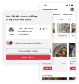
I led the redesign of the OpenTable app to build trust by increasing in-app reviews. The main goal was to enable users to connect with friends and view their latest restaurant reviews, giving them confidence to book tables based on friends' recommendations.
Here, I’ll provide an overview of my UX/UI process, which was completed over the course of 2 weeks.
Usability Audit • Competitor Benchmarking • User Flow • Information Architecture • Wireframing • Prototyping • Usability Testing
This feature isn't just about adding friends, it's about weaving their trusted opinions into your decision-making process.
The challenge I faced was to enhance the OpenTable App by building trust among existing users through increased in-app reviews.
I aimed to address this by enabling users to connect with friends and view their latest restaurant reviews—a feature that was previously missing.
To tackle this challenge, I started by conducting a thorough competitor benchmarking of both direct and indirect competitors, Yelp and Google, ensuring our experience aligned with industry standards. During the ideation phase, mind mapping proved invaluable for brainstorming, leading to the development of a new feature called "Friend Card." This feature allows users to connect with friends and view their reviews.
To simplify the user experience, I reduced the steps needed to invite friends and designed a dedicated card for friends' reviews, enhancing its overall appearance with clear calls to action.
This approach not only made it easier for users to invite friends but also boosted their confidence in reserving tables based on trusted recommendations from their friends.
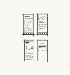
I reduced the use of red to make clickable areas stand out more, minimizing screen clutter to guide users more clearly to where they need to click.
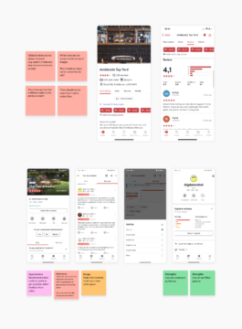
While evaluating the app's usability, I noticed several issues, such as white icons being hard to see on pictures, an overuse of red on important buttons, and a lack of clarity about what elements were clickable. These problems led to user frustration, particularly on the restaurant screen, where the layout was difficult to follow due to an abundance of options, making navigation confusing.
Users were unsure how to move to the next screen, like on the Reviews screen, where clicking again to see All Reviews added unnecessary steps and wasted time.
To improve this, I selected a new font, reduced the use of red to make clickable areas clearer, and ensured that clickable parts stood out more, making the app easier to use.
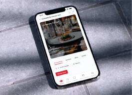
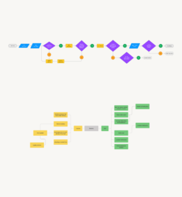
In conclusion, I improved the review user flow by removing one step, allowing users to go directly to "All Reviews." This change made room for a valuable new feature—Friends' reviews—showing that simplifying can lead to better and more useful features. Once the prototype was ready, I created a simple script for a moderated test and shared it with testers using Maze, including a clear introduction to provide context.
OpenTable App
Building trust among existing users

Case study: redesigning the opentable app to strengthen user trust and engagement
I led the redesign of the OpenTable app to build trust by increasing in-app reviews. The main goal was to enable users to connect with friends and view their latest restaurant reviews, giving them confidence to book tables based on friends' recommendations.
Here, I’ll provide an overview of my UX/UI process, which was completed over the course of 2 weeks.
Usability Audit • Competitor Benchmarking • User Flow • Information Architecture • Wireframing • Prototyping • Usability Testing

This feature isn't just about adding friends, it's about weaving their trusted opinions into your decision-making process.
The challenge I faced was to enhance the OpenTable App by building trust among existing users through increased in-app reviews.
I aimed to address this by enabling users to connect with friends and view their latest restaurant reviews—a feature that was previously missing.
To tackle this challenge, I started by conducting a thorough competitor benchmarking of both direct and indirect competitors, Yelp and Google, ensuring our experience aligned with industry standards. During the ideation phase, mind mapping proved invaluable for brainstorming, leading to the development of a new feature called "Friend Card." This feature allows users to connect with friends and view their reviews.
To simplify the user experience, I reduced the steps needed to invite friends and designed a dedicated card for friends' reviews, enhancing its overall appearance with clear calls to action.
This approach not only made it easier for users to invite friends but also boosted their confidence in reserving tables based on trusted recommendations from their friends.


I reduced the use of red to make clickable areas stand out more, minimizing screen clutter to guide users more clearly to where they need to click.
While evaluating the app's usability, I noticed several issues, such as white icons being hard to see on pictures, an overuse of red on important buttons, and a lack of clarity about what elements were clickable. These problems led to user frustration, particularly on the restaurant screen, where the layout was difficult to follow due to an abundance of options, making navigation confusing.
Users were unsure how to move to the next screen, like on the Reviews screen, where clicking again to see All Reviews added unnecessary steps and wasted time.
To improve this, I selected a new font, reduced the use of red to make clickable areas clearer, and ensured that clickable parts stood out more, making the app easier to use.

In conclusion, I improved the review user flow by removing one step, allowing users to go directly to "All Reviews." This change made room for a valuable new feature—Friends' reviews—showing that simplifying can lead to better and more useful features. Once the prototype was ready, I created a simple script for a moderated test and shared it with testers using Maze, including a clear introduction to provide context.