The Insider
E-Learning Web App for Steinbeis University.
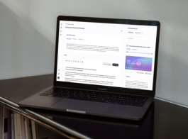
Dual screen: task info and editor on the left, resources list on the right.
UX/UI design case study
E-LEARNING Web App
for internal university use
Client
Schools of Next Practices
Steinbeis University
This project was a complete redesign of a student-facing web app for internal university use. A new visual identity and scalable design system were developed, together with a full UX rework with improved user flows and navigation. Delivered over two months, working part-time, the redesign set a new foundation for their next phase of growth and expansion.
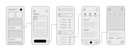
Student Journey: Navigating from Course Overview to Task Editor
UX/UI design case study:
Main Needs Behind the Redesign
The main goal was to optimize the app’s usability. I gathered direct feedback from students, who expressed common frustrations with the platform. To further explore these issues, I conducted usability tests to observe how students interacted with the app in real-world scenarios.
Research: moderated live tests
After live tests with students, I found 3 key frustrations, which became the focus of this case study:
1. Students used external tools to study, so they had to switch between tabs to edit and view resources, making work harder.
2. The list of study material uploaded by professors were stored in two separate sections, creating unnecessary confusion.
3. The old design didn’t work well on mobile, even though many students rely on it to study.
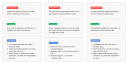
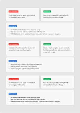
This diagram shows user frustrations turned into goals, with key questions to address them.
"When I'm on the bus, I'd like to quickly check the resources and, ideally, start preparing my essay or save important sections of the texts." — Quote from a student
Research: 3 types of users
Another key insight from the research was identifying three user types (Fig.1) based on their work styles. Understanding them was crucial to prioritize features.
- 40% Sequential Workers: They complete one task and then move on to the next, working in a linear way. They needed less interruptions between tasks.
- 30% Iterators: They make small improvements through multiple revision. They needed features like progress indicators or reminders to make it easy to come back to the app.
- 30% Copy-pasters: They prepare their work outside the app and paste it in to submit it for evaluation. They benefit from shortcuts or fast workflows for pasting.

(Fig. 1) Pie chart visualizing the distribution of daily active users by work styles.
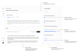
Design Solutions: Promoting Quick Interaction Between screens
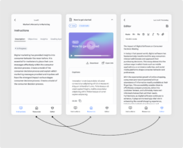
With clear needs and goals I began ideating solutions with low-fidelity wireframes, focusing on an intuitive desktop journey and easy mobile navigation. A nav bar was added on mobile for better interaction between the learning materials and text editor (Fig. 2).
(Fig. 2) Initial drafts for the mobile flow: selecting a module, choosing a task, and accessing resources.
At the heart of the platform is the Module Workspace
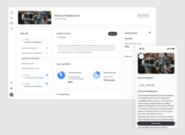
The previous design lacked a centralized solution for students, resulting in disengagement. To solve this, I created a new user journey with an updated dashboard (Fig.3). This screen is specifically designed to support and guide users before they enter the editor space. It features a to-do list or progress indicator, tools I designed for the Iterator type of worker, who works best by making improvements through multiple revisions.
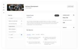
(Fig. 3) On desktop, the dashboard presents an overview of the selected task, displaying student progress to help them prepare before accessing the editor.
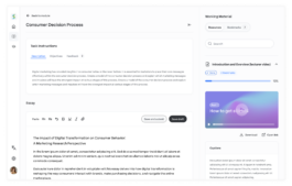
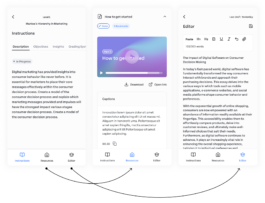
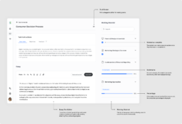
Improving Usability with a Dual-Screen Solution
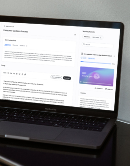
Before the redesign, poor usability forced students to rely on external tools for interacting with study materials, and they only returned to the platform to submit their essays. To address this, I created a dual-screen solution with a draggable splitter for resizing panels. This setup allows students to view and interact with the resource list while working in the editor on the same screen (Fig. 4).
(Fig. 4) Dual screen interface with the text editor and resources integrated into one view for easy interaction.
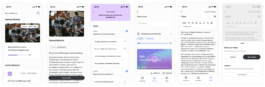
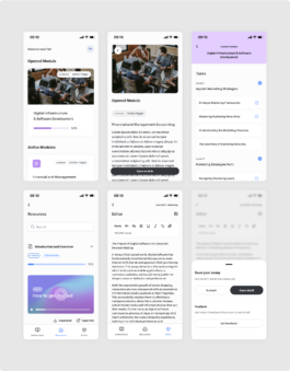
Based on key findings, I adapted the user flow for desktop and mobile, making key adjustments to fit user needs on each platform. The desktop version includes the dashboard, while the mobile version (Fig. 5) simplifies the experience, prioritizing quick access to resources for students on the go.
This approach allows desktop users to gather all the information they need from the dashboard before moving to the editor, while mobile users can immediately focus on what matters most.
(Fig. 5) Screens to interact between the task description and goals, the list of resources, and the essay editor.
Increasing Engagement: From 40% to 60% Sequential Workers:
Shifting user behavior towards more active and engaged workflows.
After launching the redesign, we saw a clear shift in how students use the platform. By prioritizing features like progress indicators and to-do lists to support Iterators (30% of users), and simplifying the user flow to create a central hub before entering the editor, we increased the number of active users who engage with the platform’s core features, from 40% to 60%.
We also saw a decrease in users who relied on external tools to copy and paste their work, dropping from 30% to 10%. This shift in user behavior shows that the redesign changed how students interact with the platform.
Thank you for reading through this UX/UI design case study.
The Insider
E-Learning Web App for Steinbeis University.
Dual screen: task info and editor on the left, resources list on the right.
UX/UI design case study
E-LEARNING Web App
for internal university use
Client
Schools of Next Practices
Steinbeis University
This project was a complete redesign of a student-facing web app for internal university use. A new visual identity and scalable design system were developed, together with a full UX rework with improved user flows and navigation. Delivered over two months, working part-time, the redesign set a new foundation for their next phase of growth and expansion.
UX/UI design case study:
Main Needs Behind the Redesign
The main goal was to optimize the app’s usability. I gathered direct feedback from students, who expressed common frustrations with the platform. To further explore these issues, I conducted usability tests to observe how students interacted with the app in real-world scenarios.
Student Journey: Navigating from Course Overview to Task Editor
Research: moderated live tests
After live tests with students, I found 3 key frustrations, which became the focus of this case study:
1. Students used external tools to study, so they had to switch between tabs to edit and view resources, making work harder.
2. The list of study material uploaded by professors were stored in two separate sections, creating unnecessary confusion.
3. The old design didn’t work well on mobile, even though many students rely on it to study.
This diagram shows user frustrations turned into goals, with key questions to address them.
"When I'm on the bus, I'd like to quickly check the resources and, ideally, start preparing my essay or save important sections of the texts." — Quote from a student
Research: 3 types of users
Another key insight from the research was identifying three user types (Fig.1) based on their work styles. Understanding them was crucial to prioritize features.
- 40% Sequential Workers: They complete one task and then move on to the next, working in a linear way. They needed less interruptions between tasks.
- 30% Iterators: They make small improvements through multiple revision. They needed features like progress indicators or reminders to make it easy to come back to the app.
- 30% Copy-pasters: They prepare their work outside the app and paste it in to submit it for evaluation. They benefit from shortcuts or fast workflows for pasting.
(Fig. 1) Pie chart visualizing the distribution of daily active users by work styles.
Design Solutions: Promoting Quick Interaction Between screens
With clear needs and goals I began ideating solutions with low-fidelity wireframes, focusing on an intuitive desktop journey and easy mobile navigation. A nav bar was added on mobile for better interaction between the learning materials and text editor (Fig. 2).
(Fig. 2) Initial drafts for the mobile flow: selecting a module, choosing a task, and accessing resources.
At the heart of the platform is the Module Workspace
The previous design lacked a centralized solution for students, resulting in disengagement. To solve this, I created a new user journey with an updated dashboard (Fig.3). This screen is specifically designed to support and guide users before they enter the editor space. It features a to-do list or progress indicator, tools I designed for the Iterator type of worker, who works best by making improvements through multiple revisions.
(Fig. 3) On desktop, the dashboard presents an overview of the selected task, displaying student progress to help them prepare before accessing the editor.
Improving Usability with a Dual-Screen Solution
Before the redesign, poor usability forced students to rely on external tools for interacting with study materials, and they only returned to the platform to submit their essays. To address this, I created a dual-screen solution with a draggable splitter for resizing panels. This setup allows students to view and interact with the resource list while working in the editor on the same screen (Fig. 4).
(Fig. 4) Dual screen interface with the text editor and resources integrated into one view for easy interaction.
Based on key findings, I adapted the user flow for desktop and mobile, making key adjustments to fit user needs on each platform. The desktop version includes the dashboard, while the mobile version (Fig. 5) simplifies the experience, prioritizing quick access to resources for students on the go.
This approach allows desktop users to gather all the information they need from the dashboard before moving to the editor, while mobile users can immediately focus on what matters most.
(Fig. 5) Screens to interact between the task description and goals, the list of resources, and the essay editor.
Increasing Engagement: From 40% to 60% Sequential Workers:
Shifting user behavior towards more active and engaged workflows.
After launching the redesign, we saw a clear shift in how students use the platform. By prioritizing features like progress indicators and to-do lists to support Iterators (30% of users), and simplifying the user flow to create a central hub before entering the editor, we increased the number of active users who engage with the platform’s core features, from 40% to 60%.
